The new year brought a new look to one of the most widely used collaborative work apps in the world. In business, change is often necessary due to a number of reasons.
As the Slack team said, “[I]t’s not change for the sake of change.” A lot of thought was put into the rebrand, and with that has come a lot of buzz on the internet — something that’s almost always beneficial for successful companies.
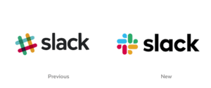
The Slack logo underwent a facelift that was intended to bring the logo’s appearance into alignment with the company’s fundamental characteristics:
- Ease of Use – The eleven colors that were featured on the original logo design have been scaled down to four primary colors, correlating a visual simplicity that represents the ease-of-use of the slack app itself.
- Scalability – The Slack application was created to allow employees and colleagues to come together in collaborative settings, no matter where they are or what they do. The new logo update was designed with this in mind.
Updating the logo from the familiar hashtag to a different version of an octothorpe enables the company to showcase its logo in different scales and contexts. The pieces can be broken apart to represent various marketing designs while still staying true to the Slack shape they represent when they’re united as a whole.
- Refinement – The new Slack icon is a more grown-up version of its former self. Slack initially launched in 2013 and the hashtag everyone associates it with has been around since long before the company became known to the world. With this logo change, the new image is slightly more sophisticated while still expounding on the playful nature of its predecessor.
Why the Change?
Slack fell into a habit of what some might call, band-aid branding. The original logo didn’t work well with some backgrounds. For example, if a background was light blue it would eat certain portions of the logo that were the same or similar to that hue. Or perhaps there wasn’t space for the exact 18° angle – a different-but-similar version of the Slack logo was created to represent the brand in those spaces.
But, in the wild, cohesion is key. Without cohesion, your customers really don’t know who you are when they see your brand in different places and, well, that’s kind of the point.
Slack’s new logo is able to be placed on different colored backgrounds, broken apart in various ways, and integrated into endless designs. It’s not just a single logo – it’s pieces of thoughtfully put together colors and pieces that can play on their own or work together to resonate optimal brand awareness.
Do You Need a Logo Do-Over?
Redesigning a logo isn’t for the faint of heart, but sometimes, it’s necessary. If you’re not getting the mileage out of your logo that you’d expect, or if you’re spinning your wheels trying to band-aid your branding, it might be time to see what a few creative minds can come up with. You won’t know until you try!
At Zero Gravity Marketing, we bring your logo design ideas to life. If you’re ready to see what brand awareness really looks like, we’re ready to show you what a facelift could do for your existing logo. Reach out to our team today!


