Email marketing gives you a cost-effective way to keep in touch with customers and attract new ones. But email is about much more than words. The way your email messages look and how fast it takes them to load play a big role when it comes to reading rates and responses. A slow-loading, lengthy, and confusing email will likely end up in the trash or, worse, the spam folder of its recipients.
Whether you’ve been sending emails for years or are just dipping your toes into email marketing, keep these do’s and don’ts in mind to maximize your impact and convert your readers.
Email Marketing Design Best Practices
Strategic email design helps to increase email click-through rate (CTR) while boosting customer loyalty. Here’s what to do so your brand can send out stellar emails:
Do: Make Your Design Mobile- and User-Friendly
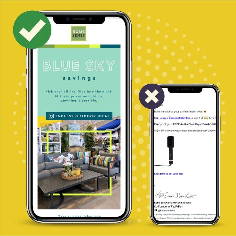
The odds are that your readers will open your emails on their smartphones or other mobile devices. To ensure everyone can read your message, use a mobile-friendly design. Picking a mobile-friendly design is easy enough – you just need to choose a responsive design template. A responsive design adjusts its size and layout based on the size of the screen, whether it’s a smartphone or laptop screen.
Test your emails before sending them to confirm they’re easy to read on a mobile device, and always preview the message on a smartphone or tablet.

Do: Keep it Short
You’ve got a lot of things to say, but your readers aren’t going to stick around and read through a novel over email. Keep your message simple and short so that people aren’t scrolling endlessly.
If you have multiple pieces of news or announcements to share, it might be better to send separate emails so that one message doesn’t get buried by the other.
Do: Break Things Up
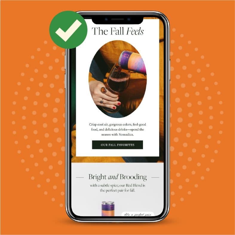
A cluttered email message is hard to read and is likely to get deleted. When choosing text and images for your emails, use plenty of white space – you want the message to look clean and easy to see where one section ends and another begins.
Along with incorporating plenty of white space in the email, use headers and short paragraphs to break it up and make it easy to scan. Headers also help to visually organize your message, so a reader can skip to the section that’s most important to them.

Do: Include a Call-to-Action
After reading through your email, a reader should have a clear idea of the purpose of the message and what you want them to do next. Always include an actionable step in the email, whether telling people to shop your sale, replying to the email to book an appointment, or calling you.
Don’t: Go Overboard on Images
A good email will have a few images to catch the reader’s attention and make the email attractive. But it’s possible, and very easy, to go too far with images. When an email has too many images, it takes forever to load, which can frustrate your readers and cause them to click away rather than click through.
Also, choose your images with care. Don’t pick a dark or patterned image as the email’s background – it can make the text hard to read.
Too many images in the email also distract from its core message and goal. If you’re not sure if you’re including too many in your emails, take at least one out.

Don’t: Use a Lot of Code
You may think using a lot of HTML code or fancy formatting in your emails makes them cooler or more fun. But, often, too much code harms the user experience. The code can slow down loading time. Some email programs can’t handle a lot of code and won’t display your emails properly.
No matter how much code you use, it’s always a good idea to include a plain text version of your email. The plain text version should include the same information as the main email but will be accessible to people who use email clients that don’t allow HTML.
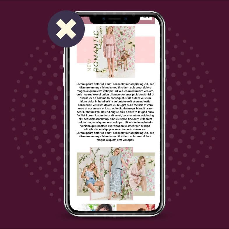
Don’t: Write Long Paragraphs
Long paragraphs, particularly on a mobile screen, can be difficult to read and may often be skipped over. People can lose their place or might lose interest halfway through reading.
To make your email more scannable, avoid overwhelming your design with content. Three lines or fewer is ideal.

Don’t: Be Boring
Your emails should entertain and enlighten a reader. If they’re dull, no one will read them, and you’re going to end up with people unsubscribing.
Good email design is all about balance. It should have enough images and features to attract readers and get them to click. Too few images and your email won’t engage the reader. Too many images lead to clutter and confusion, causing your readers to abandon ship. Remember the basic do’s and don’ts of email design, and you’ll be on your way to producing messages that get the desired results. Reach out to our email design professionals at ZGM today to get started on your email marketing strategy.

