One of the most important goals of branding is to effectively communicate messages to an audience. However, information about your brand’s identity can become lost when surrounded by overcomplicated, detail-heavy design. Therefore, it’s crucial to choose branding that highlights your key messages, rather than drowning them out. One of the most effective ways to do this is through minimalism – a sleek, simple design style that removes unnecessary elements and focuses on the most important information.
Minimalism, though plain and clear-cut, is anything but boring. When done right, it can be breathtakingly beautiful and interesting. Let’s take a look at the history of the minimalist design movement, as well as a few tips for properly executing it in your branding.
The History of Minimalist Design
Minimalist design is relatively new – it was first brought to life in the 1960s by a group of New York-based artists. The movement was founded on the principles of “geometric abstraction,” an art style that focused on the use of basic shapes.
Today, minimalism can be found in everything, from furniture to fashion, architecture, and art. It has even become a lifestyle movement, encouraging individuals to throw out unnecessary material items and take on a simpler existence.
Branding is perhaps the most effective application of minimalist design. This is due to minimalism’s unique ability to combine timeless style with sleek modernity – which creates a branding design that won’t become stale or outdated as the years go on.
How to Create the Perfect Minimalist Branding
Minimalism can be an effective and aesthetically pleasing design style for brands across all industries. However, while its inherent simplicity may elicit the assumption that it is easy to execute, this isn’t always the case. It’s true that minimalism requires fewer complex elements, but it is due to this fact that extra care must be taken in the design process. Each component should be carefully thought out to create the greatest possible impact.
Before you begin drawing up minimalist designs for your brand, keep the following tips in mind:
- Consistency is Key – Minimalism is an effective way to create a brand identity. However, to do this, you must keep your designs as consistent as possible. Regardless of whether your brand appears online, on a business card, or even on a billboard, it should maintain the same basic design elements (such as color schemes and fonts).
- Don’t Forgo Creativity – Just because minimalism cuts back on unnecessary details, doesn’t mean you have to leave creativity behind too. In fact, minimalism offers some of the best opportunities to create clever yet subtle designs. Often, creative messages communicated via simple design elements pack an even greater punch than those that are bogged down with details.
- Embrace Blank Space – White space is often considered to be “blank” and therefore useless and ineffective. However, this is far from true. White space can help balance your design and make your logo and messages stand out.
- Play with Color – While minimalism often goes hand in hand with white space, there is still plenty of room for color. When deciding on a color scheme for your minimalist designs, try to stick to just one or two hues. You can also experiment with different shades of the same color for a unique, monochromatic look.
- Choose Clean, Simple Fonts – The typeface you use should reflect the overall minimal feel of your design – not distract from it. With that in mind, sans serif fonts are a good choice. However, certain serif fonts can work well, too if they have simple strokes. As with your color scheme, you should avoid using more than two different fonts.
Our Favorite Minimal Designs
In need of some minimalist design ideas? Here are a few of our favorite designs:
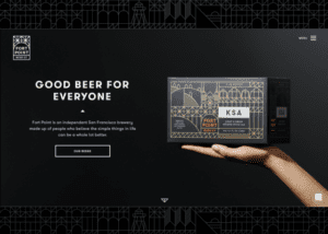
Credit: Fort Point Beer Co.
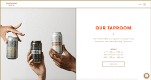
Fort Point Beer Co.’s website is an excellent example of creative minimal design. With its simple layout, clean lines, and strategic use of color, this site creates a beautiful and user-friendly experience. We especially love how the design elements of their packaging have been carried over into their digital persona.
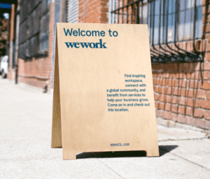
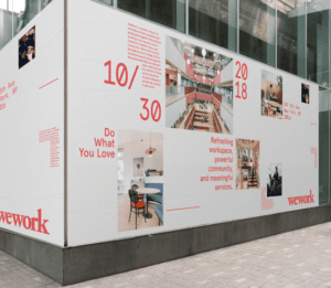
Credit: WeWork
WeWork is a global shared workspace provider that is known for its modern, aesthetically pleasing interiors. But this design style doesn’t stop at their workspaces; every aspect of WeWork’s branding design (including their website and promotional materials) uses intentional white space, simple color schemes, and unique layouts to draw interest.
Create a Unique Brand Identity with the Help of an Expert Team
Looking to create a timeless minimal design for your brand? Zero Gravity Marketing can help. Contact us today to get in touch with one of our talented designers.
