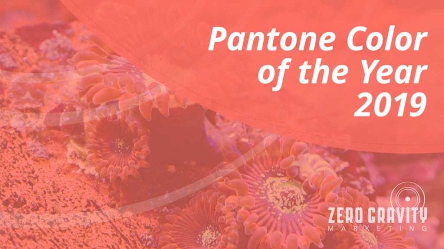
Every year, one special shade is named the Color of the Year by the Pantone Color Institute—the division of Pantone that’s responsible for having its finger on the pulse of all things pigment-related. Armed with a team of experts, the Pantone Institute announces one hue that will dominate seasonal runways and have a commanding presence across the global design landscape. The Pantone color palette contains nearly 5,000 colors, but only one can be the must-have hue each year.
This year, the Color of the Year is Living Coral 16-1546.
What You Need to Know About the Color of the Year 2019
Living Coral 16-1546 is a pinkish hue with a beautiful golden undertone that creates a certain luminescence and feeling of light. It’s an energetic color that’s designed to be as lively and bright as the real coral in the ocean.
The Pantone Institute chose Living Coral 16-1546 as a means of breaking down the barrier that exists between people, their computer, and smartphone screens, facilitating a more human element in this electronic world we live in.
How to Use the Color of the Year 2019 in Design
Living Coral 16-1546 was inspired by the sea. The ocean has a pretty spectacular color palette, and each of those elements can be integrated into designs that embrace this year’s Color of the Year.
- Create Contrast with Your Coral – You may not initially consider playing your soft-yet-vibrant pink hue against a warm-and-serene blue but give it a try before you discount this duo.If ocean blues and pinkish corals play nice in nature, there’s something naturally compatible about the combination. When you put these warm and cool shades next to each other in web and print designs, they force your font to stand out in a more meaningful way than you can do with words alone. The result of this blend is a youthful exuberance that begs for attention so subtly your audience won’t even realize it’s fallen in love with your playful display.
- Embrace a Romantic Touch – As a solo shade, Living Coral pulls at your heartstrings, hinting at the hues of flowers, hearts, and other elements inspired by romance.This is a great time to soften your messaging with ads and email blasts that impart the imagination in ways that are reminiscent of dopamine-induced interactions. Everybody loves being in love—including your customers.
- Go Au Naturale – Colors inspired by nature always work well when they’re used in natural settings. Living Coral is a spectacular shade for florals of all sorts. It also serves as an excellent background color that can showcase tons of texture and create intrigue for the eye without getting cluttered or crazy. Chose Living Coral as your shade for stones and bricks to play on the inanimate side of Mother Nature.
At Zero Gravity Marketing, we’ve been anxiously waiting to find out what the Pantone Color of the Year 2019 would be. Now that we know, we can’t wait to start designing logos, websites, and email marketing campaigns infused with Living Coral 16-1546. Want to see how this color can bring life to your brand? Let’s talk!


