Perfecting the content on your website is a meticulous process. You can have the words perfectly executed, but choices in your text can make readers stay or can turn them away. Seemingly insignificant choices, such as font and text spacing, have a great impact on the legibility and readability of your page. In this article, we will explore different fonts and layout factors to improve the readability of your pages.
Serif Versus Sans Serif Fonts
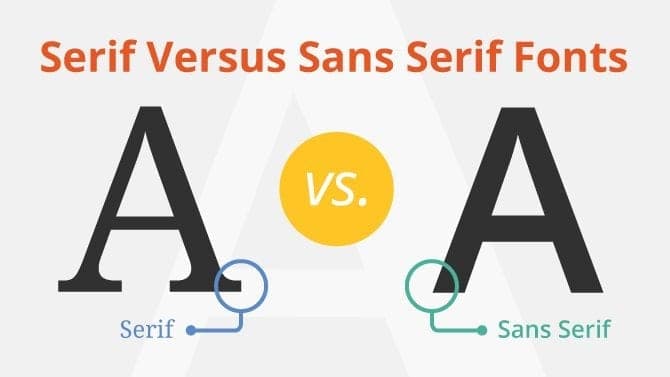
Serif fonts have stylistic points on each character, while sans serif fonts are more simplistic and functional without those stylistic points. Through research on these two font types, user experience consultant Alex Poole found that one has not excelled as more readable than the other. It seems to be a matter of which type you think looks better on your page.
Nonetheless, Poole explained that many graphic designers and other web professionals vote for sans serif fonts because it is more difficult to form the serif stylistic points with internet pixels. But this argument is only anecdotal, with research on the matter not finding a real difference between the two fonts for online reading.
In an article on Tuts+, Jeremy Loyd explains that sans serif fonts have become widespread on websites, citing potential reasons that these fonts have a modern look, fit design trends of the moment and work well for the short-form copy that is becoming popular on websites.
While saying you could really choose either type of font, the two previous sources seemed to lean toward sans serif fonts for web text. Alyssa Clarke takes a clear stand on Usability Geek, saying sans serif is the better choice for web writing, while serif works well for print. She also suggests that you choose standard fonts that readers know well because it helps them read the text more easily.
Other Readability Factors
When it comes to online readability, factors beyond the font itself seem to make more of a difference than whether you choose serif or sans serif fonts. To make your page as easy to read as possible, make sure your font size is not so small that it’s difficult to read, especially for readers with varying eyesight levels. Loyd suggests going with 13px or larger. Make headings and subheadings larger to guide the eye to different sections of text, using hierarchy to distinguish between the parts of a page.
It’s also important to focus on letter spacing, which can change a text block’s density. Minimize spacing within the content, while ensuring the letters are not too crunched for readability, while potentially increasing it for headings. Be sure to pay close attention to margins, as well as spacing between letters, lines and paragraphs. Make it easy for the eye to move from letter to letter, word to word, paragraph to paragraph and section to section.
Don’t let anything stand in the way of your reader engaging with your page, especially not something as simple as text.


