33 New Packaging Designs Launched
Redesigned Homepage Driving Conversions
Unified Brand Story Across Digital & Print
Streamlined Customer Experience Across Channels
Squeeze Pod Case Study
Squeeze Pod is a B2C consumer product company that manufactures and sells single-use travel-size toiletries. The company was looking to rebrand its packaging and website to better fit the audience that purchases its products.
Because Zero Gravity Marketing (ZGM) is a full-service agency that can provide high-quality services in both packaging design and web design, Squeeze Pod was able to get everything they needed from our team. ZGM was also able to incorporate consistency between both packaging design and graphic design on the web. This differentiated ZGM from other agencies because making those two aspects work together was imperative to Squeeze Pod.
The Challenge
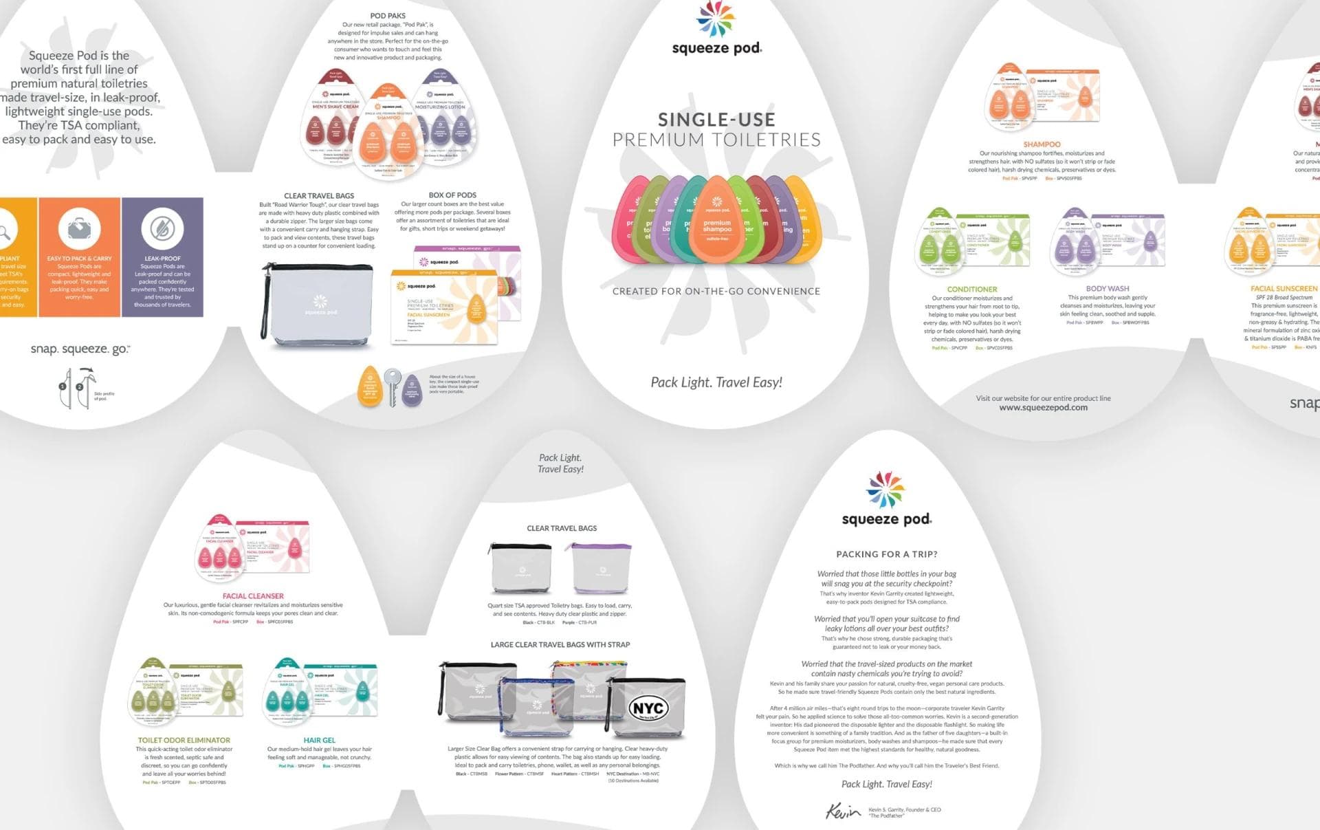
Creating the look, touch, and feel of the packaging was particularly challenging. Most brands are prepared to allow the website to do all of the brand storytelling, but Squeeze Pod made it clear that they needed the packaging and branding to continue after the products are in its consumers’ hands.
Outcome
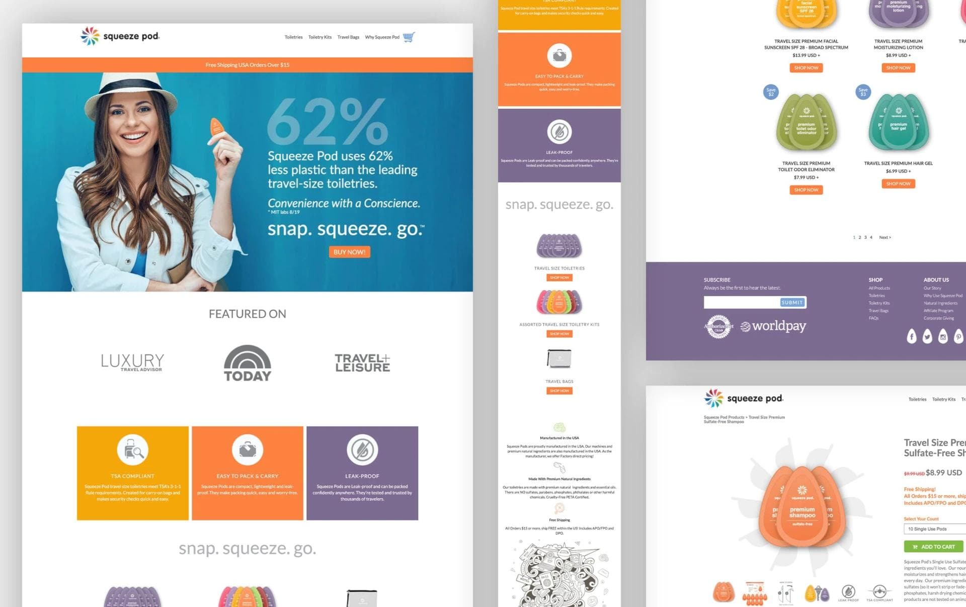
Our strategy was to collaborate with Squeeze Pod and get the best understanding possible of the brand story the client wanted to tell. This is often a crucial point in brand-building because if there is not enough communication—or if communication is unclear—it can be challenging to create and execute the right assets necessary to tell the story. Getting a deep understanding of the brand made the creation of the packaging much easier, and that was our focus. Imagery and copy could help tell the story on the site, but the personality of the brand relied on the color, look, and feel of the packaging, which is much harder to capture. Thanks to the feedback on past successes with specific audiences, our design team was able to work alongside Squeeze Pod to come up with a cohesive brand feel. Our design team utilized that feel and story to create packaging that fit the brand persona. This included graphic assets such as the homepage header images and a homepage design that fit the image Squeeze Pod wanted to portray.
Results
33
new product packaging for 33 different stock keeping units (SKUs)
1.25%
increase in conversion rates after the homepage redesign
Services Performed
Color Coordination