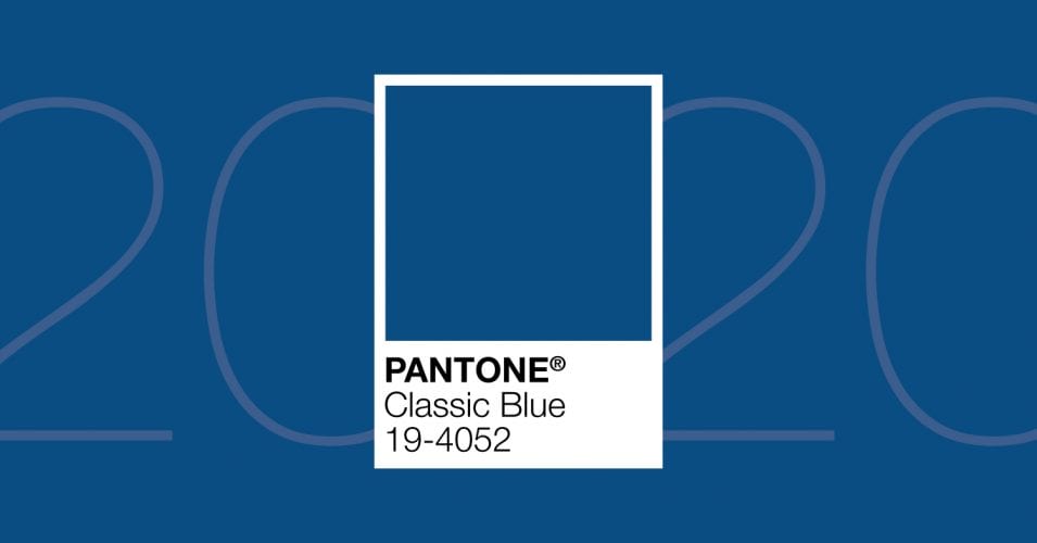
Around this time every year, the expert team at the Pantone Color Institute makes their Color of the Year announcement, picking just one shade out of their massive 5,000-hue palette. They base their choice on global influences that include nature, cultural trends, sports, and even politics.
Last year, the 2019 Pantone Color of the Year, Living Coral 16-1546, ruled runways and design palettes all over the world. This year, Pantone sensed a need for stability and foundation and decided to return to the basics. In a way, Pantone is going back to its roots by choosing Classic Blue 19-4052, a color that’s as elegant as it is simple. This shade is reminiscent of Pantone’s first-ever Color of the Year pick in 1999, Cerulean Blue. While Classic Blue is a bit darker, it still has the same reassuring feeling full of confidence and serenity.
What You Need to Know About the Color of the Year 2020
Classic Blue 19-4052 is a timeless shade that inspires a sense of calm, something that seems to be in short supply these days. It brings to mind the color of a sparkling ocean or the sky just before the sun sets.
This year’s Pantone pick is a universal color that will translate well on a variety of mediums and into the digital world, too. It’s a timeless choice for many different industries and is certainly going to make a splash in 2020.
How to Use Classic Blue in Design
According to color psychologists, blue communicates dependability and can be quite soothing to the mind. It’s also one of the most popular colors, making it a smart design choice that will appeal to almost everyone.
Here are a few ways to harness the beauty of Classic Blue in 2020:
- Contrast It with White – Whether you’re painting a room or designing a brochure, blue and white is a timeless pairing. The two colors offset each other just enough to make each pop. A Classic Blue background with contrasting white text will showcase this stunning color and get your message across at the same time. Or, if an all blue background feels too bold, use it as text color to make a statement or quote stand out in the middle of the page.
- Use It for a Soft Yet Colorful Background – At its full intensity, Classic Blue may feel too dark to be used as a background color. However, by decreasing its opacity, you can soften the shade a bit. That way, it will still deliver that feeling of foundation without overwhelming the eye.
- Use It to Make a Trust Statement – Blue is known for inspiring feelings of trust. It’s also the color of corporate America and adds a business tone to any layout. Combined, these two characteristics make Classic Blue ideal for company logos, marketing collateral, and any other client-facing elements.
Color Your World Classic Blue with Help from Zero Gravity Marketing
At Zero Gravity Marketing, our design team is ready to put Classic Blue 19-4052 to work for you in logos, websites, email marketing, and more. Contact us today to discover all of the possibilities that come with Pantone’s 2020 Color of the Year.


